
 Whatsapp
Bar Diagram vs Histogram vs Frequency Polygon: Which to Use?
Choose the right graph for your data with solved examples, clear diagrams, unequal class intervals, class boundaries, and frequency polygon steps.
- 11th
- Economics
You have a table of numbers, a ruler, and a fresh sheet of graph paper. Before you draw the first line, one decision matters more than neat shading: what is this graph supposed to show?
Perhaps you want to compare sales at four school-fair stalls. Perhaps you want to see how students’ journey times are distributed. Or perhaps you want to compare the shapes of two distributions without covering the page in overlapping rectangles.
Those are different jobs. A bar diagram, a histogram, and a frequency polygon help you do them.
The familiar shortcut, “bars have gaps, histograms do not”, is useful after you have chosen the graph. It does not explain how to make the choice. Let’s start with the data, then work through the drawing.
Choose the Graph Before Picking Up Your Ruler
Read the first column of the table, then read the question.
| What does the table contain? | What do you want to show? | A suitable choice |
|---|---|---|
| Sales at the stationery, snack, craft, and games stalls | Compare separate stalls | Bar diagram |
| Families with 0, 1, 2, or 3 bicycles | Compare frequencies at distinct numerical values | Bar diagram |
| Journey times grouped into 10-20, 20-30, and 30-40 minutes | Show where observations are concentrated | Histogram |
| The same journey-time classes for two groups | Compare distribution shapes | Frequency polygons on common axes |
| Shop sales recorded month by month | Show change through time | Usually a time-series line graph; bars can compare monthly totals |
| Cumulative numbers of students below successive marks | Locate cumulative positions, such as the median | Ogive |
If a question specifically asks for a histogram or a frequency polygon, draw that form. The decision table helps when the presentation is left to you.
Two quick checks prevent a surprising number of mistakes:
- Numbers do not automatically mean histogram. Four branches can have sales of Rs 12,000, Rs 18,000, Rs 15,000, and Rs 9,000. The branches are still separate categories.
- Frequency does not automatically mean histogram either. Counts of students choosing different clubs can go in a bar diagram.
The underlying distinction between category comparisons and grouped frequency diagrams is explained in the NCERT chapter on presentation of data, available through IIT Kanpur’s SATHEE.
Bar Diagram, Histogram, and Frequency Polygon Compared
| Feature | Bar diagram | Histogram | Frequency polygon |
|---|---|---|---|
| Horizontal axis | Categories or distinct values | Numerical class boundaries | Numerical values, with points at class midpoints |
| What is drawn? | Separate bars | Rectangles over class intervals | Points joined by straight segments |
| What carries the magnitude? | Bar height or length | Rectangle area; height can represent frequency when widths are equal | Point height on the chosen frequency scale |
| Does width matter? | Use consistent widths; they do not represent a numerical range | Yes, width represents the class interval | There are no bars; numerical spacing still matters |
| Can you rearrange the order? | Unordered categories can be rearranged sensibly | No, preserve numerical order | No, preserve numerical order |
| A useful purpose | Comparing individual categories | Seeing the distribution across intervals | Comparing shapes with less overlap |
For a bar diagram of ordered grades, discrete numbers, or years, keep their natural order. The freedom to rearrange bars applies to categories without an inherent order, such as stall names.
Worked Example 1: Compare School-Fair Stalls With a Bar Diagram
Suppose four stalls sell the following numbers of items during lunch break. These are invented practice data, as are the other datasets in this guide.
| Stall | Items sold |
|---|---|
| Stationery | 12 |
| Snacks | 20 |
| Crafts | 16 |
| Games | 8 |
The question is: which stall sold more items?
There is no interval running from “Stationery” to “Snacks”. These names identify different stalls, so draw four separate bars.
- Put the stall names on the horizontal axis.
- Label the vertical axis “Items sold”.
- Use a scale such as 1 large square = 4 items, starting at zero.
- Draw equal-width bars with equal gaps, at heights 12, 20, 16, and 8.
- Give the diagram a title that describes the comparison.
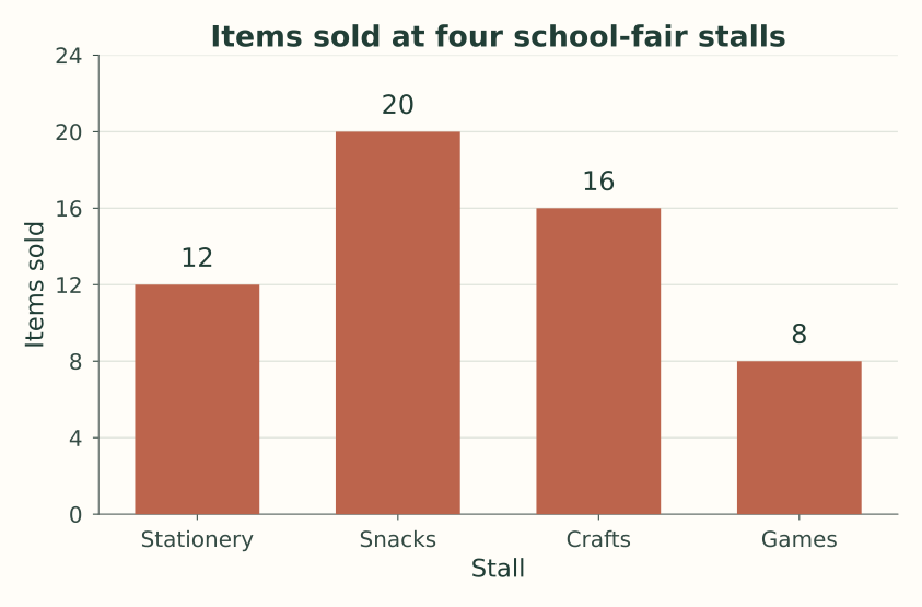
The snacks stall sold 8 more items than the stationery stall. It sold 2.5 times as many items as the games stall: 20 / 8 = 2.5.
Notice what this graph does not establish. It does not tell us which stall earned the most revenue, because the items may have different prices. A good interpretation stays with the variable actually measured.
Why the Zero Baseline Matters
If the scale started at 6, the visible bar lengths for Snacks and Games would be 14 and 2. That would make their ratio look like 7 to 1, even though the counts are 20 and 8.
Start the value axis at zero when bar lengths represent magnitudes. This also follows the Office for National Statistics guidance on chart axes.
Simple, Multiple, or Component Bars?
The example above needs a simple bar diagram: one value per stall.
If the table gives morning and afternoon sales for every stall, a multiple bar diagram can put two bars beside each other within each stall group. Include a key.
If each stall’s total is divided into cash and digital payments, a component bar diagram can split one bar into those parts. The segments must add to the total. These remain category comparisons, even when the design contains bars or segments that touch.
Worked Example 2: Show Journey Times With a Histogram
Now consider the one-way journey times of 40 students.
| Journey time in minutes | Number of students | Class width | Class midpoint |
|---|---|---|---|
| 10-20 | 4 | 10 | 15 |
| 20-30 | 8 | 10 | 25 |
| 30-40 | 12 | 10 | 35 |
| 40-50 | 10 | 10 | 45 |
| 50-60 | 6 | 10 | 55 |
| Total | 40 |
Here, 10-20 means at least 10 minutes but less than 20 minutes. A journey of exactly 20 minutes belongs in 20-30. Apply the same convention throughout so no student is counted twice.
Unlike stall names, these intervals occupy real stretches of a numerical scale. The interval 20-30 begins exactly where 10-20 ends.
Draw the Rectangles
- Mark 10, 20, 30, 40, 50, and 60 at equally spaced positions on the horizontal axis.
- Label that axis “Journey time (minutes)”.
- Label the vertical axis “Number of students” and start at zero.
- Draw a rectangle from 10 to 20 with height 4.
- Draw the remaining rectangles at heights 8, 12, 10, and 6 over their own intervals.
All class widths are 10, so frequency can be used directly as height. Keep the rectangle edges on the class boundaries.
The 10-minute span before the first observed class is not a category to squeeze into the drawing. Your numerical horizontal scale can begin at the first class boundary; it is the frequency baseline that must be zero.
Read What the Histogram Actually Says
The 30-40 minute class has the largest frequency: 12 students, or 30% of the group.
Students with journeys below 30 minutes number 4 + 8 = 12. Students with journeys from 40 to under 60 minutes number 10 + 6 = 16, or 40%.
The table does not tell us that 12 students travel for exactly 35 minutes. Thirty-five is the midpoint used to represent the class, not an observed time shared by everyone in it.
Worked Example 3: Turn the Same Table Into a Frequency Polygon
A frequency polygon uses one point for each class. For this equal-width table, plot the class midpoint against its frequency.
Class midpoint = (Lower class boundary + Upper class boundary) / 2

Midpoint of 30-40 = (30 + 40) / 2 = 35
The five main points are:
(15, 4), (25, 8), (35, 12), (45, 10), (55, 6)Join them from left to right with straight line segments. Do not smooth the corners into a curve.
Close the Polygon Using Two Extra Points
For the conventional closed polygon, imagine one extra class immediately before the first class and one immediately after the last. Give each a frequency of zero.
| Extra class | Midpoint | Frequency |
|---|---|---|
| 0-10 | 5 | 0 |
| 60-70 | 65 | 0 |
The complete plotting sequence is therefore:
(5, 0), (15, 4), (25, 8), (35, 12),
(45, 10), (55, 6), (65, 0)
These two zero-frequency points close the shape. They do not add students to the total, and they are not evidence from an additional survey.
Do not close this polygon at 10 and 60. Those are the outer boundaries of the real classes; the conventional extra points belong at the neighbouring class midpoints, 5 and 65.
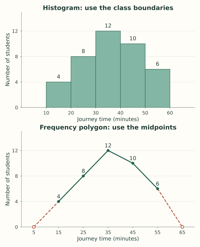
You can also obtain the polygon by joining the centres of the top edges of the histogram rectangles. You do not need to draw a histogram first if the midpoints and frequencies are already available. See OpenStax’s explanation of histograms and frequency polygons for further practice.
Unequal Class Intervals: Why Histogram Height Needs Adjusting
This is the calculation to understand properly, because “height equals frequency” works directly only when the class widths are equal.
Imagine 54 customers grouped by waiting time:
| Waiting time in minutes | Frequency | Width | Frequency density |
|---|---|---|---|
| 0-10 | 8 | 10 | 0.8 |
| 10-20 | 12 | 10 | 1.2 |
| 20-40 | 16 | 20 | 0.8 |
| 40-70 | 18 | 30 | 0.6 |
Again, each class includes its lower boundary and excludes its upper boundary.
The last interval is three times as wide as the first. If you draw its height as 18 and the first height as 8, their areas will be 540 and 80. That gives an area ratio of 6.75, although the frequency ratio is only 18 / 8 = 2.25.
The wider interval has been visually rewarded twice: once for its count and again for its width.
Method 1: Frequency Density
Frequency density = Frequency / Class width

For 40-70 minutes: 18 / 30 = 0.6 customers per minute
Draw the rectangles at heights 0.8, 1.2, 0.8, and 0.6. Label the vertical axis “Frequency density (customers per minute)”.
Now each rectangle has the correct area:
0-10:   10 x 0.8 = 8
10-20:  10 x 1.2 = 12
20-40:  20 x 0.8 = 16
40-70:  30 x 0.6 = 18

Total represented frequency = 8 + 12 + 16 + 18 = 54
These areas use the values on the axes, rather than square centimetres on the printed page. The WJEC histogram guide also explains how dividing frequency by width preserves this relationship.
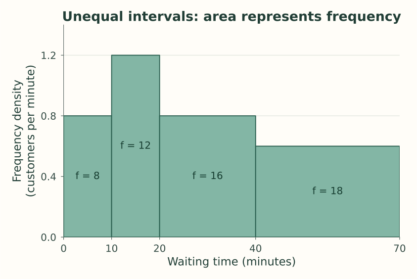
The tallest rectangle is 10-20, even though the largest raw count is in 40-70. Those statements answer different questions. One concerns concentration per unit of waiting time; the other concerns the total within a whole interval.
Method 2: Adjusted Frequency
Some classroom questions use an adjusted-frequency column based on a common width. Here, choose 10 minutes as the standard width.
Adjusted frequency = Frequency x Standard width / Actual class width| Waiting time | Calculation | Adjusted frequency |
|---|---|---|
| 0-10 | 8 x 10 / 10 | 8 |
| 10-20 | 12 x 10 / 10 | 12 |
| 20-40 | 16 x 10 / 20 | 8 |
| 40-70 | 18 x 10 / 30 | 6 |
These heights are exactly 10 times the density heights. With the corresponding vertical scale, the histogram has the same shape and its rectangle areas remain proportional to the original frequencies.
Label the axis “Adjusted frequency for a 10-minute class”. Do not label these adjusted heights as the actual customer counts or add them to find the total number of customers.
Also, keep the horizontal widths unequal. Changing both the heights and the intervals to equal widths would discard the original waiting-time scale.
Inclusive Classes: Fix the Boundaries Before Drawing
Suppose a table groups whole-number marks as 10-19, 20-29, and 30-39.
Drawing rectangles literally from 10 to 19 and then 20 to 29 leaves a gap. For this whole-number grouping, use boundaries halfway between adjacent possible marks:
| Stated class | Continuous boundaries | Width |
|---|---|---|
| 10-19 | 9.5-19.5 | 10 |
| 20-29 | 19.5-29.5 | 10 |
| 30-39 | 29.5-39.5 | 10 |
The midpoint of the first class is 14.5, whether calculated from 10 and 19 or from 9.5 and 19.5.
The 0.5 correction comes from half the gap between 19 and 20. It is not a number to subtract from every class table automatically. Data recorded to another precision require boundaries consistent with that precision.
If the classes already mean 10 to under 20, 20 to under 30, and so on, they already meet at their boundaries. Leave them as they are.
Comparing Two Groups Fairly With Frequency Polygons
Suppose Group A has our original 40 students, while Group B has 80 students with exactly double the count in each class.
| Journey time | Group A frequency | Group B frequency | Percentage in either group |
|---|---|---|---|
| 10-20 | 4 | 8 | 10% |
| 20-30 | 8 | 16 | 20% |
| 30-40 | 12 | 24 | 30% |
| 40-50 | 10 | 20 | 25% |
| 50-60 | 6 | 12 | 15% |
| Total | 40 | 80 | 100% |
A polygon of raw frequencies for Group B would be twice as high at every midpoint. That reflects its larger size. It does not mean its students have longer journeys.
To compare the distributions as proportions, use:
Percentage frequency = Class frequency / Group total x 100

Group A, 30-40 minutes: 12 / 40 x 100 = 30%
Group B, 30-40 minutes: 24 / 80 x 100 = 30%
The two percentage polygons would lie exactly on top of each other. This follows from the relative-frequency definition in OpenStax.
For a useful comparison, match the class boundaries, units, and axis scales. Use distinguishable lines and a key. If the purpose is to compare actual counts, raw frequencies are appropriate; say clearly that the groups differ in size.
What if the Polygon’s Classes Have Unequal Widths?
Do not apply the equal-width recipe without checking the question’s convention. If you are deriving the polygon from an unequal-width histogram, join the top-edge midpoints using the histogram’s density or adjusted-frequency heights. Keep the numerical midpoint spacing accurate and label the vertical axis accordingly.
A line through raw class counts is a different display. It will not trace the tops of a density histogram. For a basic comparison exercise, common equal-width classes make the interpretation much clearer; do not invent replacement class counts if the raw data needed to regroup them are unavailable.
Six Mistakes to Catch Before Submitting
| Mistake | Why it changes the meaning | What to do instead |
|---|---|---|
| Joining the tops of bars for unrelated stall names | Suggests a numerical path between categories | Keep the category comparison as bars |
| Leaving decorative gaps between histogram rectangles | Breaks the interval scale | Draw on the actual class boundaries |
| Giving a 30-minute class the same drawn width as a 10-minute class | Hides the difference in interval size | Use proportional horizontal distances |
| Plotting polygon points at upper boundaries | Moves every point away from its class centre | Calculate the midpoints first |
| Using cumulative frequencies for a frequency polygon | Changes the quantity being graphed | Use class frequencies, or draw an ogive if that is asked |
| Omitting an empty class from the middle | Compresses the numerical scale | Keep its interval with zero height or a zero-frequency point |
A zero-frequency class can leave an empty-looking region in a histogram. That is a real interval with no observations, not the decorative spacing used between bars.
Be careful with open-ended classes such as “70 minutes and above” too. Their width and midpoint are unknown. You cannot draw a fully specified histogram rectangle or midpoint-based polygon point for that class without a stated boundary or an explicit, justified assumption.
For cumulative-frequency questions, use our guide to less-than and more-than ogives.
Quick Practice With Answers
1. Choose the Graph
A shop records total sales separately for books, stationery, and gifts. Which of the three graphs is most suitable?
Answer: A bar diagram. These are product categories, even though the sales values are numerical.
2. Find a Polygon Point
The class 40-50 has frequency 18. What point should you plot for an equal-width frequency polygon?
Answer: The midpoint is (40 + 50) / 2 = 45, so plot (45, 18). Do not plot (50, 18).
3. Adjust an Unequal Class
The class 30-50 has frequency 24. Find its frequency density and its adjusted frequency using a standard width of 10.
Answer: Width = 20. Density = 24 / 20 = 1.2. Adjusted frequency = 24 x 10 / 20 = 12. The actual class frequency remains 24.
4. Recover a Frequency From a Histogram
A rectangle covers 20-35 minutes and has frequency-density height 0.8. How many observations does it represent?
Answer: Frequency = width x density = 15 x 0.8 = 12.
5. Close a Polygon
The real classes are 20-30, 30-40, and 40-50. Give the two extra zero-frequency points for the conventional closed polygon.
Answer: The extra classes are 10-20 and 50-60, so add (15, 0) and (55, 0).
6. Compare Groups of Different Sizes
In one marks interval, 9 of Group A’s 30 students and 15 of Group B’s 60 students are counted. Which group has the larger proportion in that interval?
Answer: Group A has 9 / 30 x 100 = 30%. Group B has 15 / 60 x 100 = 25%. Group B has the larger count, but Group A has the larger proportion.
Before handing in a graph, check the title, axis labels, units, scale, boundaries or midpoints, and one plotted value against the table. Finish with a sentence explaining what the graph shows. A drawing earns its place when the reader can understand the numbers through it.
Frequently Asked Questions
What is the main difference between a bar diagram and a histogram?
A bar diagram compares separate categories or distinct values through bar lengths. A histogram represents frequencies over numerical intervals through rectangle areas. Its widths carry information about the class intervals.
Why do bar diagrams have gaps while histograms usually do not?
Bar gaps separate categories. Adjacent histogram classes share boundaries, so their rectangles meet. A zero-frequency class can create an empty interval, which must stay in its correct position.
Can a bar diagram show frequency data?
Yes. For example, the number of students choosing each school club is frequency data that suits a bar diagram. Look at what is being counted and how the values are grouped.
Can whole-number data be shown in a histogram?
Yes, if grouped into numerical intervals with appropriate boundaries. Whole-number marks grouped as 10-19 and 20-29 can be drawn using 9.5-19.5 and 19.5-29.5. A small set of distinct values, such as bicycles per family, may be clearer as separate bars.
Is histogram height always equal to frequency?
No. Direct frequency heights are suitable when the class widths are equal. For unequal widths, use frequency density or a consistently calculated adjusted frequency so that rectangle areas remain proportional to class frequencies.
What is the difference between frequency density and adjusted frequency?
Frequency density is frequency divided by class width. Adjusted frequency multiplies that density by a chosen standard width. The vertical-axis label must identify which you use.
Do I need a histogram before drawing a frequency polygon?
No. For equal-width classes, calculate each midpoint, plot it against the class frequency, and join the points with straight segments. Add the conventional zero-frequency endpoints to close the polygon.
Where do the first and last zero-frequency points go?
At the midpoints of imaginary neighbouring classes immediately outside the real distribution. If the real classes run from 10-20 through 50-60, use (5, 0) and (65, 0).
Is a frequency polygon the same as a line graph or an ogive?
No. A frequency polygon plots class frequencies at midpoints. A time-series line graph plots observations against time. An ogive plots cumulative frequencies at the relevant class boundaries.
Which graph is best for comparing two distributions?
Frequency polygons are often convenient because several lines can share the same axes without overlapping blocks hiding each other. Use matching classes and scales, and consider percentage frequencies when group sizes differ.
Does the tallest rectangle always contain the most observations?
Only when the widths are equal and the height scales are comparable. With unequal widths, a tall narrow rectangle can represent fewer observations than a shorter wide one. Read the area, or multiply density by width.
Can I rearrange histogram classes to put the tallest rectangle first?
No. Histogram classes follow a numerical scale, so moving them changes the distribution. Sorting can be useful for unordered categories in a bar diagram, but it does not apply to histogram intervals or frequency-polygon points.
Looking for commerce tuitions?
Prachi is a gold-medalist commerce teacher with experience at Deloitte and KPMG. She focuses on fundamentals to build a strong foundation.